Client
ESTRO
Year
2021
Role
Brand Concept
Visual Identity
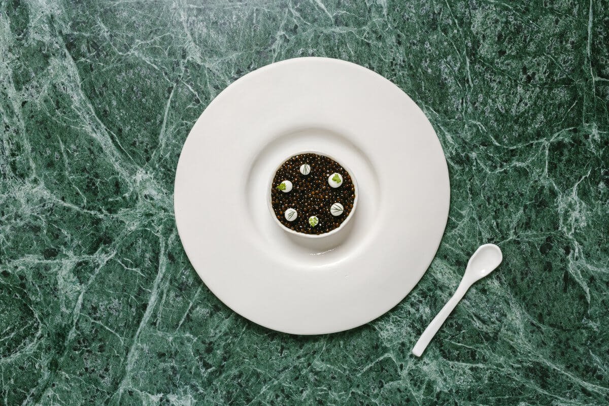
ESTRO is Hong Kong’s first Italian fine dining restaurant by JIA Group to offer an exclusive tasting menu. An homage to the Neapolitan hometown of award-winning chef Antimo Maria Merone, the concept is a contemporary reimagination of culinary traditions from the coastal shores of Southern Italy.
ESTRO adopts the spirit of the Italian Renaissance, introducing a new era of culinary nostalgia in contemporary dining.
The concept draws upon the lost ideals from the classical era, merging them with contemporary ideas to deliver a re-imagined dining experience. Offering old and new awakenings alike, the tactile details of ESTRO’s environments, signage, and collaterals transports guests into the old world aesthetics of Europe’s most influential movement.
Memory forges the cuisine → The cuisine revives the memory
Memory forges the cuisine → The cuisine revives the memory
A powerful identity system is created to translate the culinary ambition at ESTRO. Inspired by the infinitely cyclical loop of memory. Swathed in ocean greens and earthy coral tones. As ever a tribute to its Neapolitan roots, ESTRO’s visual language is imbued across all collaterals, including the digital menus printed on the back of brass coins, resembling those used by the Roman empire. Emulating the innovative processes behind every dish, our bespoke touches on brand identity opens up creative possibilities.
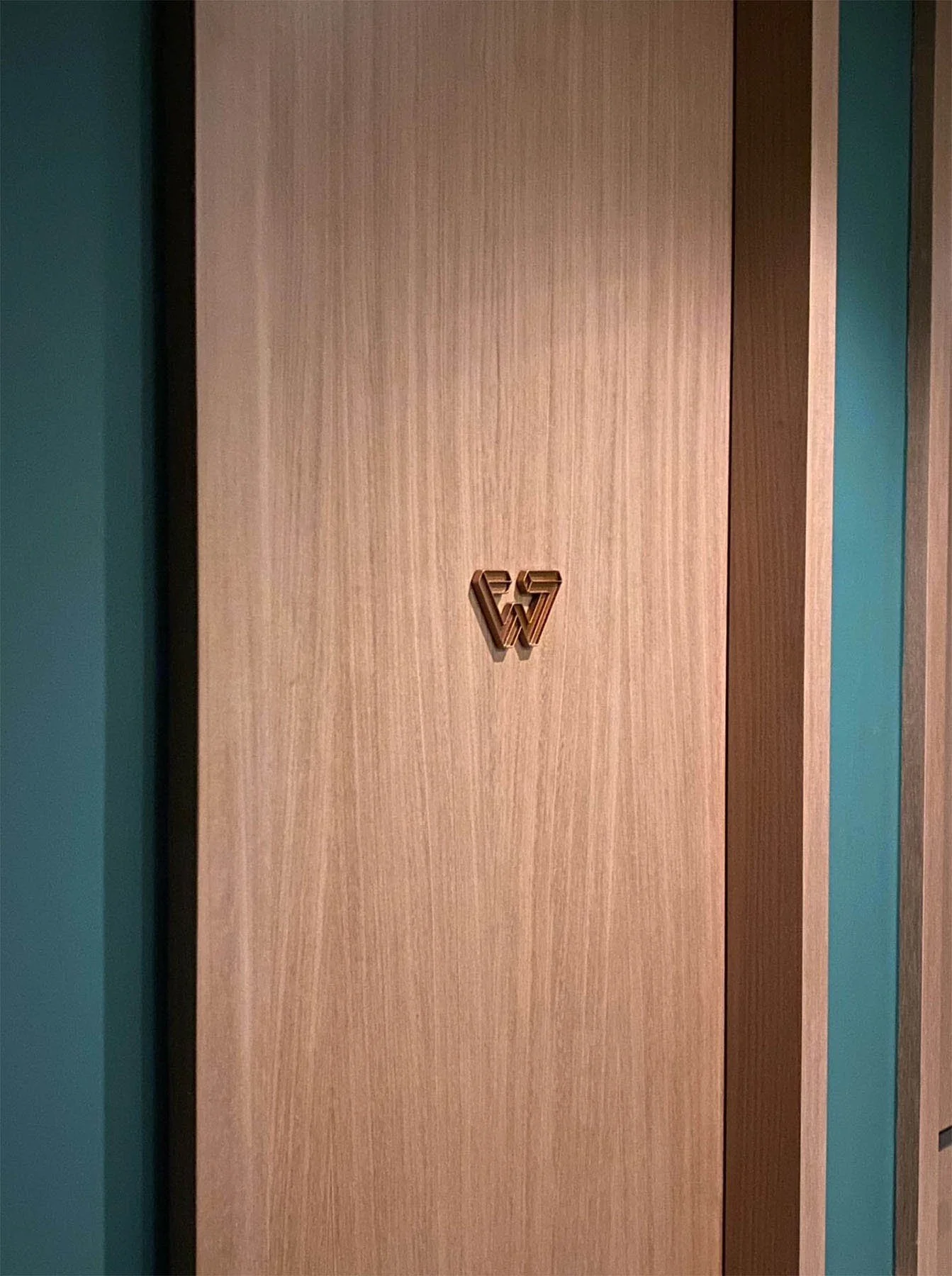
An ode to the chef’s creative visions, ESTRO’s secondary graphic references M.C. Escher, one of many artists who was inspired by and adapted the ideas of the Italian Renaissance.
In line with the rebirth of traditions, the Dutch artist’s experiences echoes the chef’s own creative culinary journey. ESTRO’s graphic language uses the unconventional sequences and tessellations, echoing the humanist philosophy at the heart of Italian hospitality and exclusive fine dining traditions.


